Tuesday, May 9, 2017

Assignment 6

Jeff Hessburg
Assignment 6
11 May 2017
Geog 370

Part I
Using the linear regression tool in SPSS, it is possible to determine the regression equation for the independent variable: Crime Rate, and the dependent variable: Percent of Kids that get Free Lunches.
The regression tool gives an R Squared value of .173.  This means that only 17.3% of Percent of Kids that get Free Lunches can be explained by crime rate.
The Coefficient table, shown below, can be used to create the regression equation for the given data.
The regression equation is Y= 40.380 + .102 X
Y = percent of kids that get free lunch
X = Crime Rate
If a new area of town was identified as having 23.5% of kids with free lunch, the equation can be used to determine Crime Rate
23.5= 40.380 + .102 X -->   .102X= -16.88 -->  X= -165.49

Obviously crime rate cannot be a negative number. The reason this result is not accurate is because the R squared value is so low. Therefore there is little confidence in these results. There is, however, a significant value below .05 meaning there is a relationship. the relationship is also positive.

Part II 
The goal for this part of the assignment is to locate the best location to build an ER room based on where the most 911 calls occur
Step 1
3 independent variables that will be analyzed using to regression analysis to determine if there is a relationship between them and 911 calls are:
Low Education
R squared= .567
There is a very low significance value meaning that the null hypothesis can be rejected and there is definitely a positive relationship between low education and 911 calls.
For every unit of increased LowEduc there is a .116 increase in 911 calls.

Unemployed
R squared= .543
There is a very low significance value meaning that the null hypothesis can be rejected and there is definitely a positive relationship between unemployed and 911 calls.
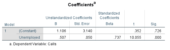
For every unit of increased Unemployed there is a .507 increase in 911 calls.

Median Income
R squared= .163
There is a very low significance value meaning that the null hypothesis can be rejected and there is definitely a negative relationship between MedIncome and 911 calls.
For every unit of increased MedIncome there is a -.001 decrease in 911 calls.

Step 2
The map above shows the number of 911 calls in each county


The map above shows how much 911 calls are correlated to Low Education spatially.The red areas are locations where the actual values are larger than the model estimated. The blue areas are locations where the actual values are smaller than the model estimated.

Part 3
Using SPSS it is possible to run a Collinearity Diagnostics test to see if there is Multicollinearity.  The results are below. 
Multicollinearity is not present. looking at the 9th row, there is a Eigen value close to 0, so there is a chance. The Condition index, however, in the 9th row is below 30, therefore multicollinearity is not present.


Above is the results of the coefficients after running a stepwise regression analysis. Looking at the beta, LowEduc has the highest results, meaning that the average amount the 911 calls increases the most when the LowEduc variable increases one standard deviation and the other independent variables are held constant.

*Already created above is the residual map for LowEduc
(just by chance)

Step 4
After looking at these results, the best place to build an ER room would be in the northwest part of the county. This is because this is where the most calls seem to occur, also because this is where the lowest education of the county is found, allowing the planners to infer that there will be more calls from this area, now that they have been proven this is the most influential variable.   


Tuesday, April 25, 2017

Assignment 5

Assignment 5
Jeff Hessburg
25 April 2017

Part I
For white population
There is a positive correlation with:
Median household income, number of manufacturing employees, number of retail employees, and number of finance employees. the correlation for median household income is lower than the others, but the sig. is still low enough to say there is a correlation. 

For black population
There is a negative correlation with:
Median household income, number of manufacturing employees, number of retail employees, and number of finance employees. None are very close to -1, but all sig. are low enough to reject the null hypothesis

For Hispanic population
there is a positive correlation with:
Number of retail employees, and number of finance employees. The retail relationship does not have a low enough sigs to say that there is a an actual correlation. 
There is a negative correlation with:
Median household income,  median household income, number of manufacturing employees

Part II
Introduction
For this assignment, the Texas Election Commission (TEC) wants analysis of the patterns of elections and Hispanic population in Texas. The specific data being analyzed is Hispanic population, percent of democratic votes for the 1980 presidential election, voter turnout for the 1980 presidential election, percent of democratic votes for the 2016 presidential election, and voter turnout for the 2016 election. The goal is to see if there there is spatial auto-correlation of voting results for each of the elections as well as voter turnout. Also TEC wants to know if clustering is present, perhaps with Hispanic populations.

Methodology
To analyze the data, the excel sheets that contained all of the information about the Hispanic population and voter data had to retrieved off of the Census Website. Then they had to be minor edited, and added to ArcMap. The tables must be joined together with a shape-file of Texas. This is because, Geoda, the program that runs spatial auto-correlation analysis can only to the analysis with shape-files. The Geoda program will give the results wanted. The program will provide Moran's I scatter plots and LISA cluster maps for all of the data.

Results
Percent Hispanic Population
These result shows, with high correlation, that, generally, Hispanic populations are clustered together. 

Percent Democratic Votes for 1980 Election
These results show the clustering of democratic votes (red) and clustering of non-democratic votes (blue). The Moran I scatter plot shows there is a fairly strong correlation between location and voting patterns. 

Voter Turnout for 1980 Election
These results show where the high voter turnout is (red) and low voter turnout (blue). 

Percent Democratic Votes for 2016 Election
These results show the clustering of democratic votes (red) and clustering of non-democratic votes (blue). The Moran I scatter plot shows there is a fairly strong correlation between location and voting patterns. It can be noted that is a difference in these results and the 1980 results. 


Voter Turnout for 2016 Election
These results show where the high voter turnout is (red) and low voter turnout (blue). 

Conclusion
   These results show that there is clear clustering of democratic voting. It tends to be primarily in the southern parts of the state. from 1980 to 2016 democratic voting clusters have gone from the eastern part of the state to the west. This is similar with the non-democratic votes. they have always been in the north, but moved east to west.
   The results also highlight voter turnout. According to the maps, voter turnout is very low in the southern parts of the states, and higher in the northern parts, the patterns are similar from 1980 to 2016, except in 2016 there is a new cluster of low voting in the northwestern part of the state.
   The first part of the results shows where there are clusters of Hispanic populations. These are in the south and southwest parts of the states. This makes sense because this is where Mexico boarders Texas. Analyzing the maps, it is evident that democratic votes corresponds to Hispanic population. It also seems like there may be some relationship between low voter turnout and Hispanic populations.

Sunday, April 2, 2017

Assignment 4

Assignment 4
Jeff Hessburg
GEOG 370
2 April 2017

Part one of this blog requires completing the table below:
What is needed is
α = which is the significant level for a given test. To figure out this value; first look if the interval type is one tailed or two tailed. 
- If the interval type is One Tailed, than take 100 and subtract it from the confidence level, then times by (1/100) to get α
- If the interval type is two tailed, there is an extra step. Take 100 and subtract it from the confidence level, the times by (1/100), then finally divide by two, to get α.

Next it must be decided if the test is a z test or a t test. The test is will be a z test if n (the sample size) is greater than 30. If n is less than 30, a t test is required. 

Lastly, the Critical Value for the given Significance Level needs to be determined. This can be determined by looking at a table that gives the values for the given test type. If the test type is z, then the following table must be used. To read the table, take 1-α, then find the value on the graph, this will give the z value
http://www.stat.ufl.edu/~athienit/Tables/Ztable.pdf

If the test is a t test, the following table is used. to read it, first the degrees of freedom is needed to be calculated. This can be calculated by using the following equation: n-1. Use degrees of freedom and the α in the top row. This will determine the t value


http://d2r5da613aq50s.cloudfront.net/wp-content/uploads/451675.image0.jpg
For z and t test, If the interval type is two tailed, the negative and positive z or t values must be included.
The completed table is below:


For the second question in this assignment, an estimate from the Department of Agriculture and Live Stock Development is compared to the survey of 23 farmers. The estimate includes; ground nuts, cassava, and beans. Shown below are the calculations for t-value,  a visualization of where the t value places on a standard distribution with 95% confidence, the probability of the actual value, and if the hypothesized mean is rejected or failed to be rejected. 
There are not many similarities or differences. None of the hypothesis fell very close to the mean, but only one got rejected. One hypothesis fell above the mean and two below. 


For Part three the objective is to calculate if a researches suspicion of if a stream is polluted above the allowable limit. The calculations and results are shown below. 


PART II
Null hypothesis- There is no difference between the value of City of Eau Claire homes and the homes in all of Eau Claire County. 
Alternative hypothesis- There is a difference between the value of City of Eau Claire homes and the homes in all of Eau Claire County. 
Statistical Test- Two tailed Z test. Z test because the sample size is larger than 30 and two tailed because the null hypothesis could be rejected if the test gets results above or below the mean. 
An α of .05 was chosen because, after literature review, it was discovered that .05 is chosen for most average tests like this. There are worries of type I and type II error but not much of one over the other. 95% confidence level is perfect when trying to avoid both errors. 
Below are the calculations that determine if the null hypothesis can be rejected. 
It can be concluded that there is a difference between the average value of homes in the city of Eau Claire, and the County of Eau Claire as a whole.
Below is a visual representation of the average value of home in its given block group.


Tuesday, March 7, 2017

Assignment 3

Jeffrey Hessburg
Assignment 3
GEOG 370
9 March 2017

For this assignment, I have been hired by an independent research consortium to study the geography of foreclosures in Dane County, Wisconsin.  County officials are worried about the increase in foreclosures from 2011 to 2012.  As an independent researcher I have been given the addresses of all foreclosures in Dane County for 2011 and 2012. My goal is to explain the patterns and provide some understanding to the trends in the foreclosures. 

The following are calculations of the Z scores of three separate Census Tracts. Each Tract has a calculation based on the Count2011 data and a calculation based on the Count 2012 data. To make the calculation, the mean and standard deviation of the Count2011 and Count2012 data is needed. To find these I went under symbology then to Quantities and clicked on Classify.  Once I clicked on Classify a box under Classification Statistics displays the Mean, and Standard Deviation. The last thing needed is the Xi value of the 3 census tracts. These can be located in the attribute table. Once all of the values are found, the following equation is used to calculate the Z scores: Zi=(Xi-μ)/S where Zi=Z-score, Xi=Observation of I, μ= Mean of the data, S= Standard deviation of the data. 

For Count2011 mean 11.39 Standard deviation 8.776
Calculation three tracts:
Census Tract 122.01: Xi=6      (6-11.39)/8.776      Zi= -0.6141
Census Tract 31:        Xi=24    (24-11.39)/8.776    Zi= 1.437
Census Tract 114.01: Xi=32    (32-11.39)/8.776    Zi= 2.348

For Count2012 mean 12.30 Standard deviation 9.906
Calculation three tracts:
Census Tract 122.01: Xi=6       (6-12.30)/9.906    Zi= -0.6360
Census Tract 31:        Xi=18     (18-12.30)/9.906  Zi= 0.5754
Census Tract 114.01: Xi=39     (39-12.30)/9.906  Zi= 2.695

The Z-score calculations show how many standard deviations away from the mean each tract is. Tract 114.01 is the furthest from the mean and tract 31 is closest.

The map below shows changes in foreclosures from 2011 to 2012. Positive numbers indicate more foreclosures in 2012 than 2011. Negative numbers indicate more foreclosures in 2011 than 2012.
The question is asked: if these patterns for 2012 hold next year in Dane County, based on this Data what number of foreclosures for all of Dane County will be exceeded 70% of the time? Where on the map will this most likely happen?
To solve this I look at the z-score chart to determine the z-score for 70%. The z-score is -0.52.
I can then enter this in the Count 2012 equation to determine the Xi value then evaluate potential Census Tracts that have this value.
(Xi-12.30)/9.906=-0.52     Xi=7.149
This result means that, based on the 2012 data, 70% of the time, a county track will have more than 7.149 foreclosures. 
The map above is good for illustrating the areas in Dane County that have the least amount of foreclosures. These are the blue areas.

What number of foreclosures for all of Dane County will be Exceeded only 20% of the time?  
Z Score 0.84
(Xi-12.30)/9.906=.84   Xi=20.62
This result means that 20% of the time, based on the 2012 data, a county track will have more than 20.62 foreclosures.
The map above is good for illustrating the areas in Dane County that have the most amount of foreclosures. These are the pink areas.


Conclusion:
It is clear to see that there are big spatial patterns involving foreclosure in Dane County. It appears that in 2012 the highest number of foreclosures are the bigger sections not in the center or in the southern parts. The lowest number of foreclosures are the smaller sections in the center of the county, and just a couple outside the center. 
It is also clear to see big change in the number of foreclosures from 2011 to 2012. This can be observed in the first map. The lightest and darkest colors indicate this change. Based on the first map and the increased mean from 2011 to 2012, if the same trend continues, I believe that there will be even more foreclosures in 2013 than in 2012. 

Monday, February 20, 2017

Assignment 2

Assignment 2
Jeff Hessburg
2/21/2017
GEOG 370

PART I
For this assignment, I will be comparing two bike race teams who competed in the TOUR de GEOGRAPHIA; Team ASTANA and Team TOBLER The comparisons will inlude the range, mean, median, mode, kurtosis, skewness, and standard deviation, of the race times for each team. After analyzing the calculations, I will determine which team I would rather invest in, to make the most money.

The Results:

Range- The range is a calculation of the largest value subracted by the smallest value. For this example, the range can be explained by how much time faster the first person on each time finished compared to the slowest. The difference between the fastest and slowest person is much great on team Tobler than team Astana.
Team ASTANA=1 hr 10 min
Team TOBLER=31 min

Mean- The mean is the average of all of the numbers. To calculate, all of the times are added up then divided by the total number of times. for this example, the mean is the average time the bikers on each team finished.
Team ASTANA =37 hr 56.67 min
Team TOBLER=38 hr 5.47 min

Median- The median is the middle number when all values are put in order. For this example, there are 15 bikers. That means the median is the the average of the 7th and 8th place finisher.
Team ASTANA=38 hr
Team TOBLER=38 hr 9 min

Mode- The mode is the value that occurs most frequently. For this example, this means the results are the times that racers on each team finished most frequently.
Team ASTANA=37 hr 52 min and 38 hr
Team TOBLER=38 hr 9 min

Kurtosis- The kurtosis is the sharpness of a peak of a distribution curve. A number above one means the distribution has a peak, a number less than -1 means the distribution is relatively flat. A peak means that most of the values are close together. A flat distribution means the values are more spread out. For this example, both values are greater than one, this means that the distribution curve is peaked and the values are relatively close together.
Team ASTANA=1.168
Team TOBLER=2.927

Skewness (Population)- The skewness is a measurement of how symmetrical the distribution curve is. Positive numbers means the mean will be be to the left with a tail to the right. A negative number means the mean will be to the right with a tail to the left. Numbers above 1 or below -1 means there is a skew. The closer to 0, means the smaller the skew. For this example, team Astana has almost new skew whatsoever and team Tobler has a negative skew.
Team ASTANA=-0.00231
Team TOBLER=-1.0259

Standard Deviation- The standard deviation is a statistic that explains how tightly a group of values are to the mean. the picture below is the best way to explain it.
Team ASTANA=16.63
Team TOBLER=7.62

My job is to determine which team is better to invest in.
The individual race winner gets 75% of a $300,000 pool  ($225,000) and the owner gets 25% ($75,000)
The team that wins receives 65% of a $400,000 pool ($260,000) and the owner gets 35% ($140,000)

Based off of the last race in the TOUR de GEOGRAPHIA, there is a good chance that the first place finisher will come from Astana, which is a guaranteed $75,000. 
The prompt does not explain how the team wins. I am guessing that it is just an average of all of the racers to determine how well the team did communally. the statistic that would determine this is the mean. So based off of the mean, team Astana would also be the best team to invest in. 

PART II
Below is a map of Wisconsin. On the map are three points. The yellow star shows the geographic mean center of the state. This means the very middle of the state. The green dot shows where the mean center of population of the state was in 2010, and the red dot shows where the mean center of population was in 2015. These are points of where geographically the average person in Wisconsin lives. these points are influenced from every direction. If there are more people in the south, the dot will be further south. If there are more people living in the west, the dot will be further to the left. It can be noted that the dot from 2010 to 2015 has moved slightly west. A reason for this change must mean that there are more people living in the west. Perhaps a big city like Eau Claire has had a increase in population which moved the population mean center. 


Wednesday, February 1, 2017

Assignment 1

Jeffrey Hessburg
GEOG 370
Spring 2017

For part I, I will explain the difference between Nominal, Ordinal, Interval, and Ratio Data.

Nominal data is data where each unit is assigned to a category. They are used for labeling variables, with no numerical significance. A type of nominal data is hair color. A given person can be labeled one type of hair color. For example; red, blonde, or brunette.  Another good example of nominal data is an electoral college map. Each state fits into a category of which president received the most votes. 

http://www.270towin.com/presidential_map_new/maps/gv32O.png
It is clear to see that each state fits into either Trump or Clinton. Two labels. 

Ordinal data is data where the values are ranked. The relationship from one data to another is based on if that data is more than or less than. An example of ordinal data is a company asking how satisfied people are with their products. They could answer:
1. Very Unsatisfied
2. Unsatisfied
3. Neutral
4. Satisfied
5. Very satisfied
Each of these answers gives the company data how much more or less each person is satisfied. 
Ordinal data can be quantitative. It can place values in categories then be ordered. An example is the map below of this. 
https://blog.zingchart.com/assets/zing-content/uploads/2015/11/Screen-Shot-2015-11-18-at-11.53.17-AM.png
In this map above, each county groups together every immunization percentages in California child care facilities and determines the percentages. Then the map viewer can determine which county has less than or greater than percentages of immunizations, relative to another county. 

Interval data is data on a numeric scale, where the order and difference between values is known. There is no true zero with interval data. For example, with an elevation map, there is never 0 elevation, it is just a reference. Below is an example of an elevation map, 
https://bgommartin.files.wordpress.com/2015/11/the-white-space-representing-the-elevation-change-between-two-contours-is-called-the-contour-interval.png?w=580
It can be noted that the differences are measurable with each contour line. 

Ratio data is similar to interval data, but there is a known zero. This means that it is possible to measure differences as well as ratios; how much larger or smaller one piece of data is compared to another. an example of ratio data is weight. there is a known 0.  No matter has negative mass. Another example, that can be mapped, number of vehicles per person in New York. There is no such thing as negative cars. 
http://la.streetsblog.org/wp-content/uploads/sites/2/2010/12/NY-Vehicles-Per-Person.jpg
It should be noted that there is a distinct 0 on this map. 

Part II
For part two my goal is to help my agriculture consulting/marketing company to increase the number of women as principal operators of a farm. To do this I have been instructed to create 3 maps showing the number of women principle operators for every county in Wisconsin. The first step to completing this goal is going to the U.S. Census website and downloading a shapefile that has every Wisconsin county. Next that shapefile must be added to ArcMap and joined together with an excel document that has the amount of women farm operators in each county. Once the data is joined together, each county is grouped into one four sections based on how many women farm operators there are in each county. The group they are placed in is determined by the classification method. Three different methods were used; equal interval, quantile, and natural breaks. All are shown in the three different maps below. Each map is comprised of the same data, the only difference is how the data is classified. After the classification was determined, an appropriate color scheme was chosen. Finally basic map elements were added such as a title, legend, north arrow, scale, and reference box. 

Equal Interval
The equal interval method classifies the number of women principle farm operators into groups that contain an equal range of values.


Quantile
The quantile method classifies the number of women principle farm operators into groups that contain an equal number of values.


Natural Breaks
The natural breaks method classifies the number of women principle farm operators into groups that are designed to determine the best arrangement of values into different classes.  
Only one of these maps is to be used to persuade women to become principle farm operators. In my opinion I believe that the best map to use for this purpose is the equal interval map. Compared to the other two maps, the equal interval map makes it look like there are hardly any women that are principle farm operators in Wisconsin. I think that because of this, it has the capability to inspire women to believe that they can change that, and become principle farm operators themselves. 

References:
Part I:
http://www.mymarketresearchmethods.com/types-of-data-nominal-ordinal-interval-ratio/
Notes from class were also used
*the link where each picture came from is beneath each picture 
Part II:
for definitions: http://support.esri.com/other-resources/gis-dictionary/term/natural%20breaks%20classification
*the data used for the maps are on the bottom right of each map