GEOG 370
Spring 2017
For part I, I will explain the difference between Nominal, Ordinal, Interval, and Ratio Data.
Nominal data is data where each unit is assigned to a category. They are used for labeling variables, with no numerical significance. A type of nominal data is hair color. A given person can be labeled one type of hair color. For example; red, blonde, or brunette. Another good example of nominal data is an electoral college map. Each state fits into a category of which president received the most votes.
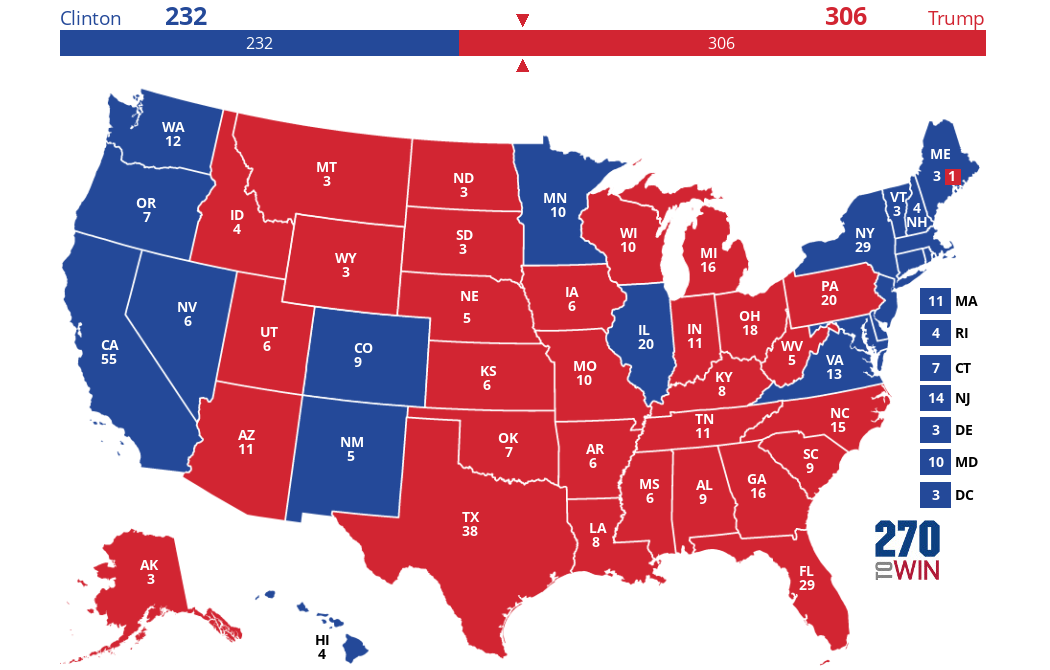
http://www.270towin.com/presidential_map_new/maps/gv32O.png
It is clear to see that each state fits into either Trump or Clinton. Two labels.
Ordinal data is data where the values are ranked. The relationship from one data to another is based on if that data is more than or less than. An example of ordinal data is a company asking how satisfied people are with their products. They could answer:
1. Very Unsatisfied
2. Unsatisfied
3. Neutral
4. Satisfied
5. Very satisfied
Each of these answers gives the company data how much more or less each person is satisfied.
Ordinal data can be quantitative. It can place values in categories then be ordered. An example is the map below of this.

https://blog.zingchart.com/assets/zing-content/uploads/2015/11/Screen-Shot-2015-11-18-at-11.53.17-AM.png
In this map above, each county groups together every immunization percentages in California child care facilities and determines the percentages. Then the map viewer can determine which county has less than or greater than percentages of immunizations, relative to another county.
Interval data is data on a numeric scale, where the order and difference between values is known. There is no true zero with interval data. For example, with an elevation map, there is never 0 elevation, it is just a reference. Below is an example of an elevation map,

https://bgommartin.files.wordpress.com/2015/11/the-white-space-representing-the-elevation-change-between-two-contours-is-called-the-contour-interval.png?w=580
It can be noted that the differences are measurable with each contour line.
Ratio data is similar to interval data, but there is a known zero. This means that it is possible to measure differences as well as ratios; how much larger or smaller one piece of data is compared to another. an example of ratio data is weight. there is a known 0. No matter has negative mass. Another example, that can be mapped, number of vehicles per person in New York. There is no such thing as negative cars.

http://la.streetsblog.org/wp-content/uploads/sites/2/2010/12/NY-Vehicles-Per-Person.jpg
It should be noted that there is a distinct 0 on this map.
Part II
For part two my goal is to help my agriculture consulting/marketing company to increase the number of women as principal operators of a farm. To do this I have been instructed to create 3 maps showing the number of women principle operators for every county in Wisconsin. The first step to completing this goal is going to the U.S. Census website and downloading a shapefile that has every Wisconsin county. Next that shapefile must be added to ArcMap and joined together with an excel document that has the amount of women farm operators in each county. Once the data is joined together, each county is grouped into one four sections based on how many women farm operators there are in each county. The group they are placed in is determined by the classification method. Three different methods were used; equal interval, quantile, and natural breaks. All are shown in the three different maps below. Each map is comprised of the same data, the only difference is how the data is classified. After the classification was determined, an appropriate color scheme was chosen. Finally basic map elements were added such as a title, legend, north arrow, scale, and reference box.
Equal Interval
The equal interval method classifies the number of women principle farm operators into groups that contain an equal range of values.

Quantile
The quantile method classifies the number of women principle farm operators into groups that contain an equal number of values.

Natural Breaks
The natural breaks method classifies the number of women principle farm operators into groups that are designed to determine the best arrangement of values into different classes.

Only one of these maps is to be used to persuade women to become principle farm operators. In my opinion I believe that the best map to use for this purpose is the equal interval map. Compared to the other two maps, the equal interval map makes it look like there are hardly any women that are principle farm operators in Wisconsin. I think that because of this, it has the capability to inspire women to believe that they can change that, and become principle farm operators themselves.
References:
Part I:
http://www.mymarketresearchmethods.com/types-of-data-nominal-ordinal-interval-ratio/
Notes from class were also used
*the link where each picture came from is beneath each picture
Part II:
for definitions: http://support.esri.com/other-resources/gis-dictionary/term/natural%20breaks%20classification
*the data used for the maps are on the bottom right of each map
No comments:
Post a Comment